Potluck Labs
My Role
As the lead designer, I worked on creating the end-to-end experience for Potlock Campaigns from how users discover campaigns, projects, List to how they create, donate, and track progress. I collaborated closely with the product manager, three developers, and a brand designer to ensure the platform felt approachable for everyday users while maintaining the trust and transparency expected from an on-chain product. My role covered user flows, interface design, interaction logic, and component standardization within the Potlock ecosystem.
Research Methods
User interviews, competitor benchmarking (GoFundMe, Gitcoin, and Juicebox), prototype testing sessions with early donors and campaign creators, and heuristic analysis of existing Potlock donation patterns.
Team Structure
1 Designer (me), 3 Developers, 1 Brand Designer, 1 Product Manager.
Platform
Web, Mobile
Duration
2 Months
Responsibilities
UX Design, UI Design, User Research, User Testing
Potlock Campaigns was designed to make fundraising on the blockchain more accessible and trustworthy. It allows anyone to create campaigns for specific initiatives whether it’s a project, charity, or personal goal and raise funds transparently using escrow protection.
As Lead Designer, my goal was to simplify the entire experience: helping users understand how campaigns work, track their progress clearly, and feel confident that their funds were secure.
Objectives
Every Potlock feature begins with a purpose: to make decentralized funding more approachable.
For Campaigns, the objective was to let people raise funds for causes they care about while keeping the flow transparent and the rules simple.
Empower User-Led Fundraising
Allow anyone to create a campaign and raise for projects or organizations without technical knowledge.

Build Trust Through Transparency
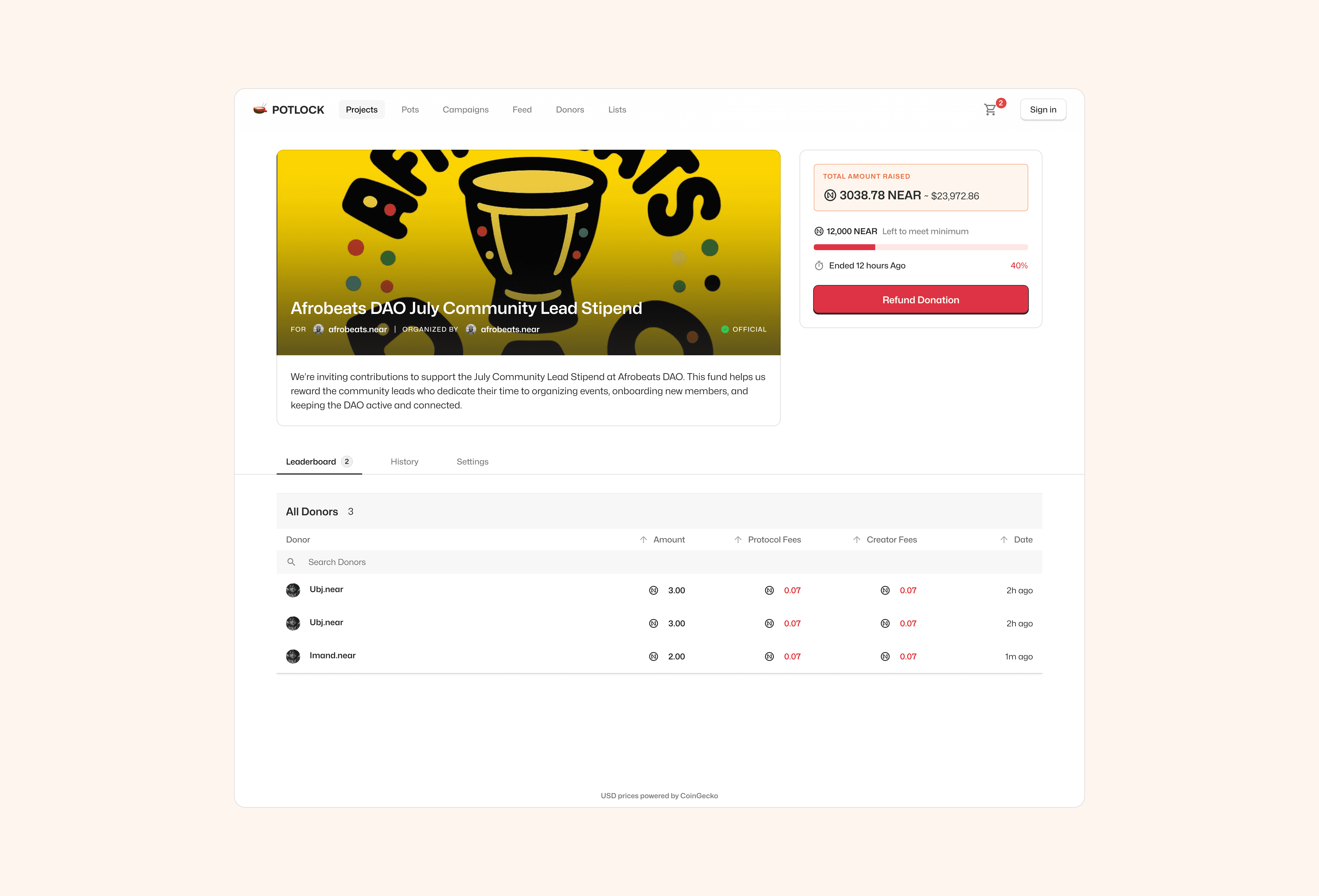
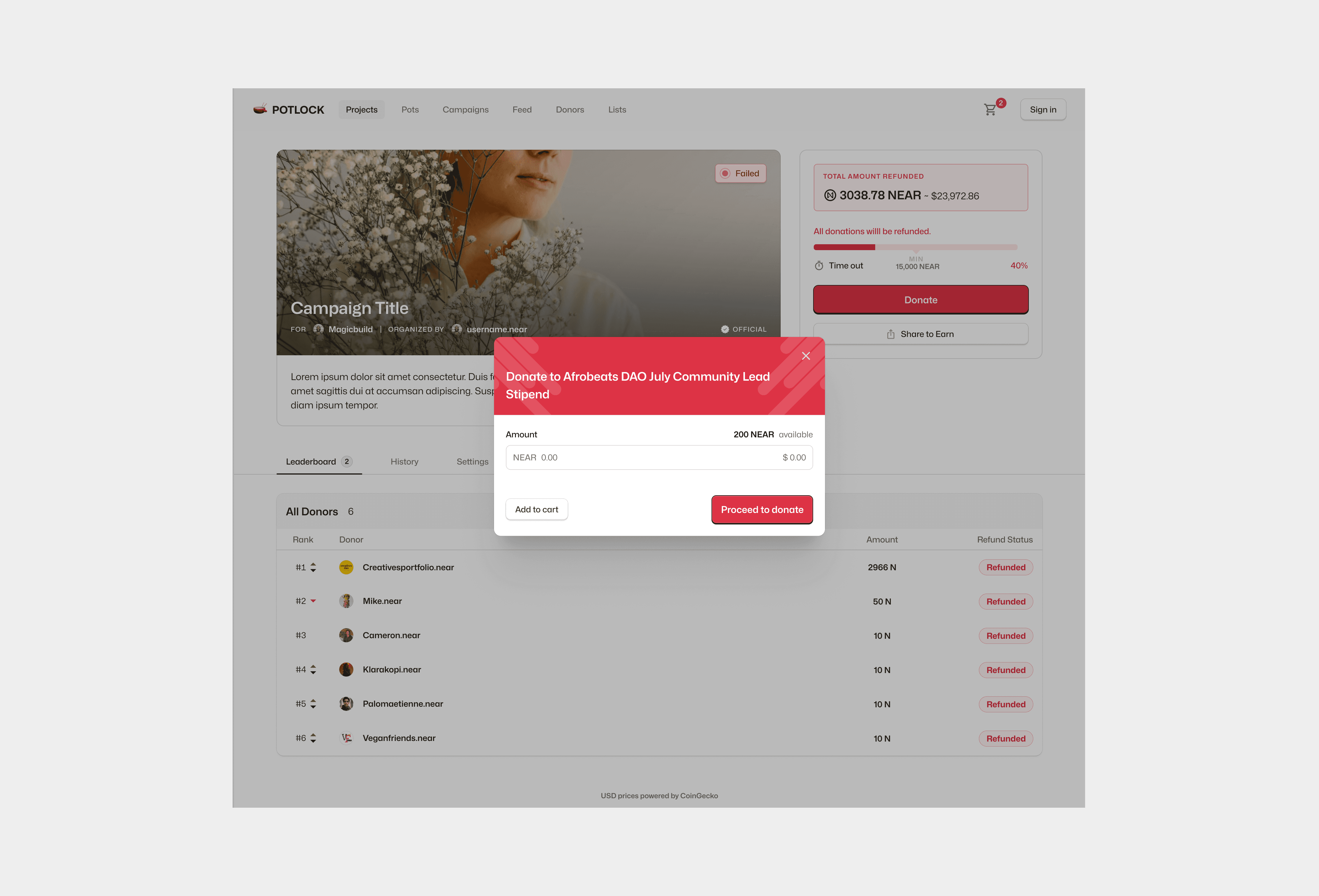
Design clear UI states to show when a campaign is escrowed, refunded, or successfully funded.

Encourage Community Participation
Integrate referral links and social sharing so campaigns spread organically through user networks.
Ensure Smooth Cross-Chain Donation Experience
Simplify how users send tokens from any supported blockchain, using NEAR Intents for conversion.
Strategic Value
Potlock Campaigns transforms how funding happens in the open-source world. Instead of waiting for grants or institutional rounds, individuals can now raise directly for what matters to them with accountability built into the interface. This positions Potlock as the most human-centered funding layer in the NEAR ecosystem.

Intuitive Campaign Creation Flow
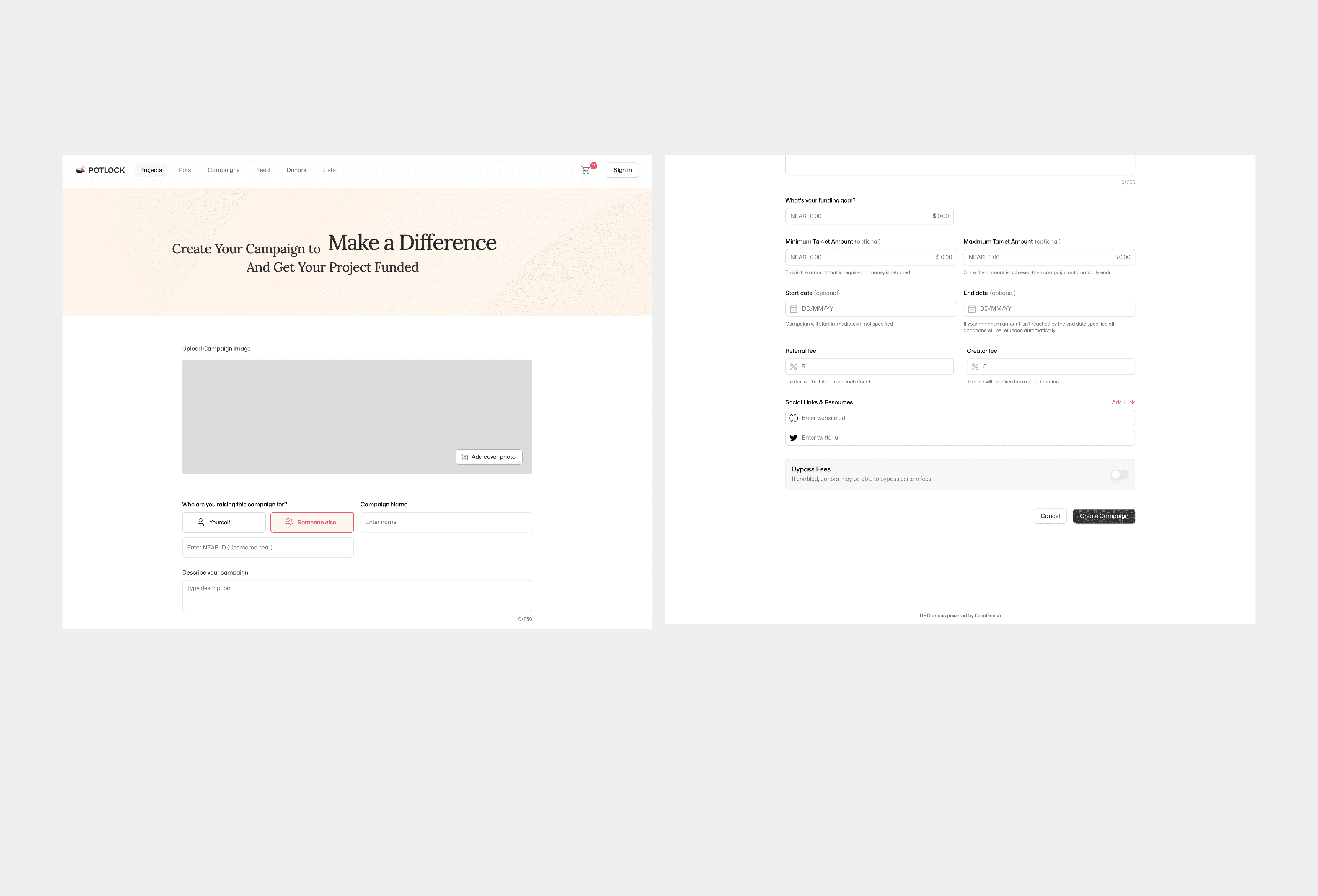
Reduced setup complexity into a few guided steps, allowing anyone to launch a campaign in minutes with clear options for escrow or pass-through funding.

Visual Transparency for Donors
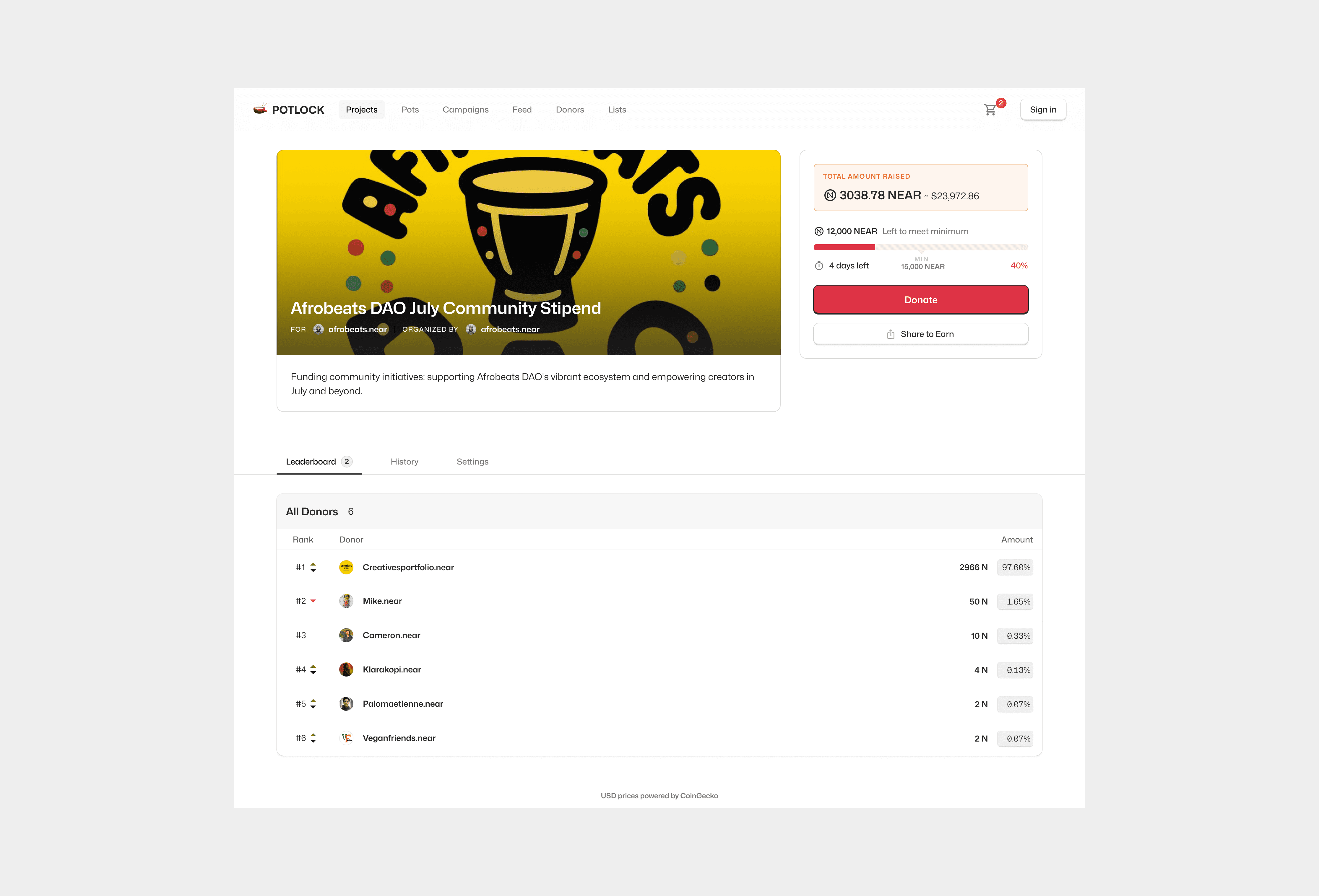
Designed a campaign dashboard that displays progress, goals, top donors, and refund conditions in one place creating confidence and repeat participation.

Unified Discovery and Donation Experience
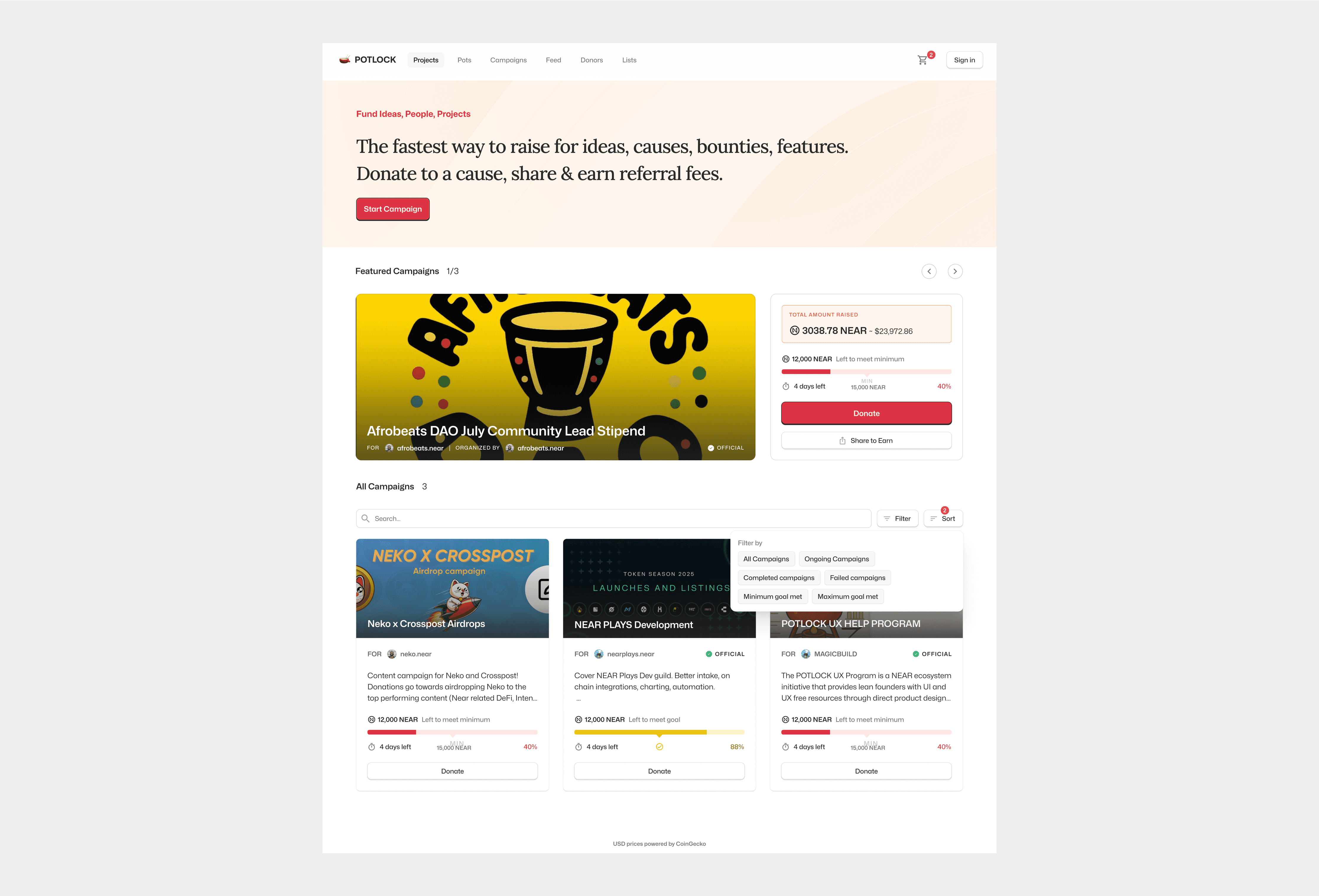
Built a filterable, card-based campaign discovery page that surfaces trending, official, and user-led initiatives, giving equal visibility to large and small campaigns alike.
The Challenges
Every project comes with constraints. For Potlock Campaigns, the challenges came from balancing blockchain mechanics with everyday usability.
Explaining Escrow Logic Clearly
Users struggled to understand what “escrowed” meant and when funds would release or refund.
Preventing Form Fatigue
The campaign creation form risked overwhelming users with too many fields and blockchain terms.
Differentiating Official and Fan Campaigns
We needed a way to show which campaigns were approved by an organization and which were community-led.
Managing On-Chain Transparency
Each transaction had to be traceable without cluttering the interface.
Encouraging Campaign Sharing
Many users launched campaigns but failed to promote them effectively; the product had to prompt sharing through subtle nudges.
The Plans
To solve these challenges, the design process focused on simplicity, feedback, and modularity.

Design a guided campaign setup flow that clearly separates basic info from advanced settings.

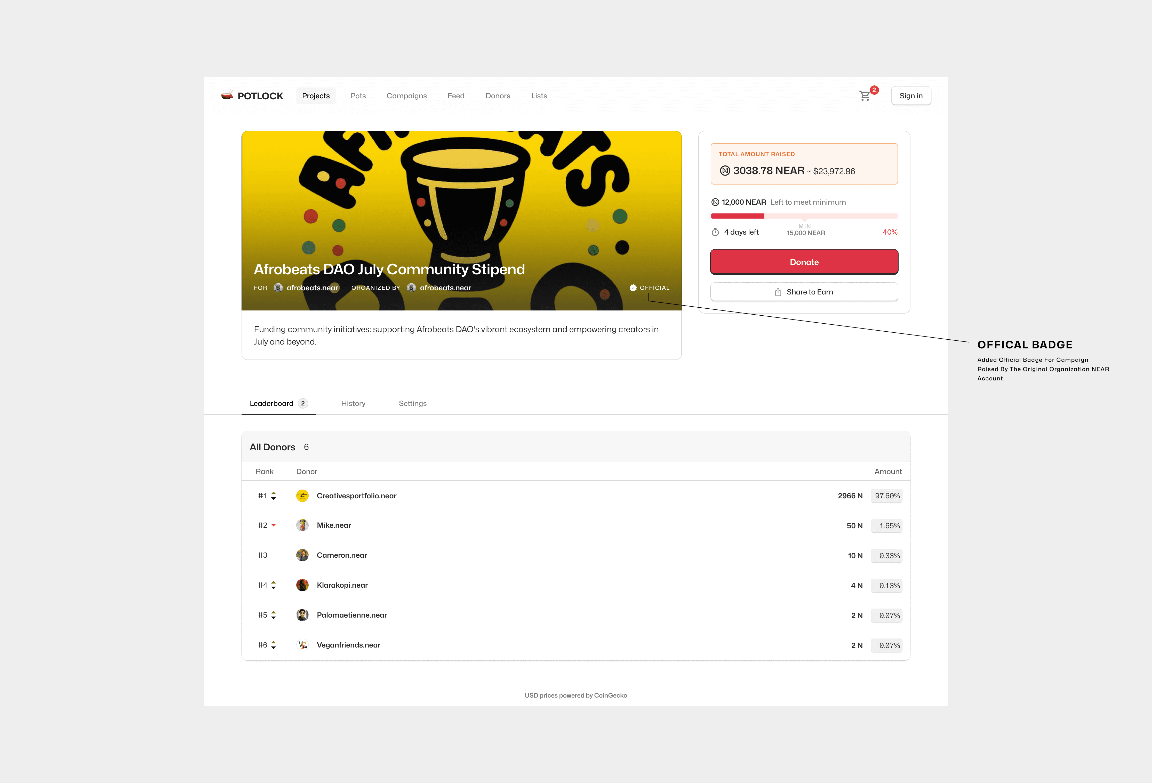
Introduce “official badge” indicators to distinguish organization-approved campaigns.

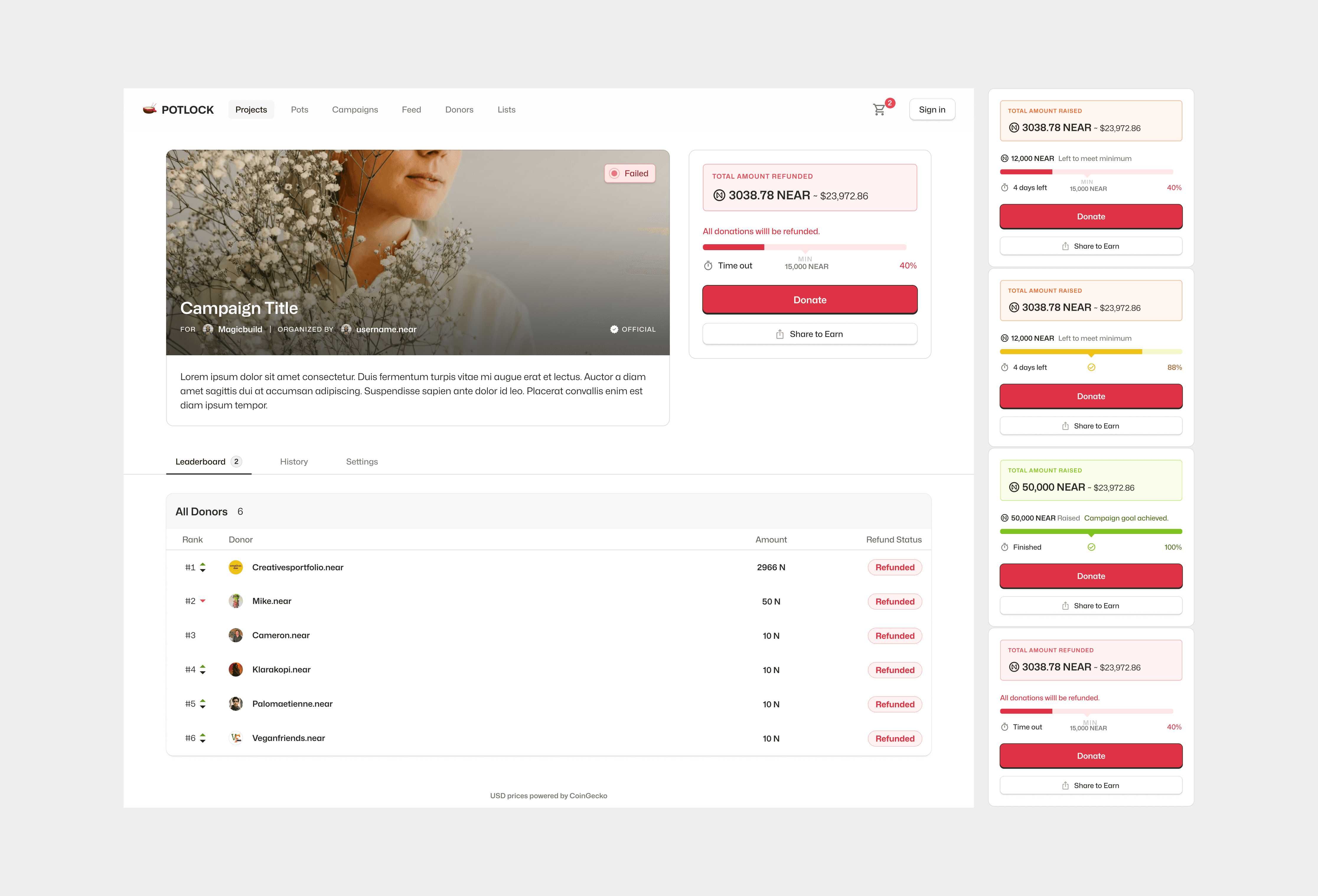
Add progress visuals that show escrow milestones and donation breakdowns.

Make sharing part of the journey by adding a post-launch screen with share links and referral codes.

Simplify empty states and success feedback with expressive visuals that guide next actions.
Research & Discovery
Research was essential to understand how users perceive decentralized fundraising and how to reduce friction in a complex flow.

User Interviews
Conducted interviews with 10 users who had experience with GoFundMe or blockchain donations to understand motivation and hesitation.

Competitive Review
Studied traditional fundraising tools (GoFundMe, Kickstarter) and Web3 platforms (Gitcoin, Juicebox) to identify best UX practices.
Survey on Donor Confidence
Ran short polls on NEAR social communities about what makes people trust campaigns.

Campaign Creators
Everyday users or advocates who want to raise funds for a specific project, event, or cause.
Create and customize new campaigns with images, descriptions, and funding targets.
Choose between escrow or pass-through funding options.
Share campaign links across social media and communities.
Monitor donations and update campaign progress in real time.
Confusion around escrow settings and minimum funding thresholds.
Difficulty promoting campaigns or gaining early visibility.
Overwhelmed by multiple form fields and blockchain terms during setup.
Unclear difference between “official” and community campaigns, reducing perceived legitimacy.

Donors & Supporters
Users who discover, evaluate, and contribute to campaigns on Potlock.
Browse campaigns through filters like “official,” “ending soon,” and “trending.”
View campaign details, donation goals, and proof of legitimacy.
Donate directly using tokens or NEAR Intents conversions.
Track contributions, refunds, and referral rewards.
Uncertainty about refund guarantees when targets aren’t met.
Lack of clear visual indicators of campaign legitimacy.
Hard to see donation impact beyond the transaction confirmation.
Limited feedback or reward system after donating.

Partner Organizations
Projects or nonprofits who approve, manage, or benefit from campaigns raised on their behalf.
Review and approve community-created campaigns.
Access dashboards showing campaign performance and donor data.
Communicate updates and acknowledgments to donors.
Manage referral fees and campaign ownership rights.
Difficulty distinguishing between genuine and unofficial campaigns.
Limited visibility into who is raising funds on their behalf.
Need for automated trust signals and transparency in fund flow.
Manual tracking of campaign outcomes and payouts.

Ecosystem Evangelists
Community builders, event organizers, or developers using campaigns to fund public-good initiatives.
Launch campaigns for hackathons, developer bounties, or education programs.
Manage multi-campaign visibility across regional communities.
Encourage recurring contributions through referrals or social engagement.
Track cross-chain contributions and payout accuracy.
Pain Points
Managing several campaigns at once without a unified dashboard.
Difficulty explaining to new contributors how escrow works.
Lack of easy sharing tools for campaigns across platforms.
No clear way to analyze performance or donor trends.
Insights & Recommendations
After multiple test sessions and early feedback from campaign creators and donors, we identified several usability gaps in how people interacted with campaigns. These insights helped refine everything from donation clarity to privacy and flow consistency. Each recommendation was implemented directly in the design to simplify decision-making and increase trust.
Insights 1
Donors didn’t trust campaigns without visible verification.
Test users said they wanted assurance that a campaign was legitimate and connected to a real organization or project. Without verification, some assumed the campaigns might be scams or inactive.
Recommendations 1
We introduced verified badges and linked campaigns directly to campaign owner profiles. Verified campaigns now appear higher in the discovery feed with subtle blue highlights and verification text. This small visual cue immediately improved credibility and donation intent.
Insights 2
Escrow refunds confused users.
Users struggled to understand what would happen if a campaign didn’t reach its minimum goal. Many weren’t sure when or how refunds would occur, and the text-only status indicators felt unclear.
Recommendations 2
We redesigned the campaign progress bar with visual cues green for active campaigns, yellow for “Pending Minimum,” and red for refunded campaigns. This color-coded system simplified comprehension and reduced refund-related support messages.
Insights 3
Campaign discovery felt noisy.
With dozens of active fundraisers on the platform, users found it difficult to locate relevant or trusted campaigns. The feed lacked hierarchy and filtering options.
Recommendations 3
We implemented advanced filters for Trending, Ending Soon, and Official Campaigns. Each filter dynamically sorts campaigns by engagement metrics or verification status, helping users find meaningful causes faster and improving overall discoverability.
Insights 4
Users were confused about creating campaigns for others.
During testing, many users struggled to understand whether they were creating a campaign for themselves or on behalf of a project. This led to mistakes during setup and unclear ownership records.
Recommendations 4
We updated the Create Campaign form with a clear units asking users to specify who they’re raising for. If they’re creating for another project or person, they can now input the recipient’s wallet ID. To make setup easier, we added inline tooltips explaining each field and its purpose, reducing setup errors and improving completion rates.
Insights 4
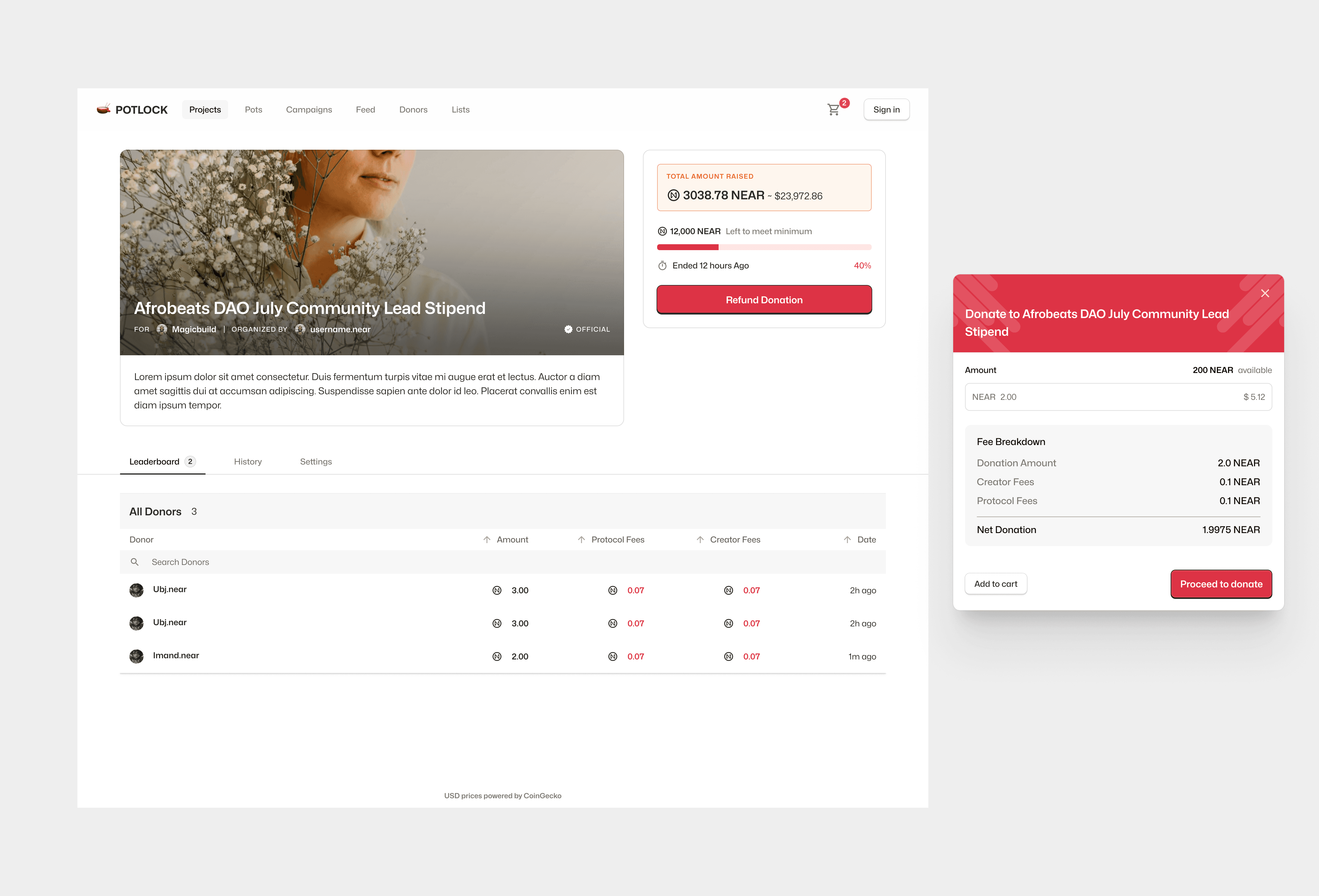
Users wanted clarity on how fees and donations were distributed.
Many donors were unsure how much of their contribution reached the campaign versus what went to platform or referral fees. The lack of transparency made them second-guess completing the transaction.
Recommendations 5
We introduced a transparent fee breakdown on the donation confirmation screen, showing exactly how each percentage is allocated. Tooltips were added beside every fee type to explain its purpose, making the experience more trustworthy and predictable.
Learnings
Designing Potlock Campaigns reinforced the importance of clarity in crypto UX.
When forms feel like conversations, users finish them confidently.
Icons, badges, and color systems communicate better than blockchain jargon.
Showing refund protection upfront reassured donors more than any tooltip.
Working directly with developers early on prevented technical friction later.
Next Steps
With the base experience complete, the next phase focuses on deepening engagement and expanding reach.
Allow creators to embed their campaign directly on their own website or community hub.
Streamline multi-chain contributions and auto-conversion for easier fundraising across ecosystems.
Copyright 2024 by Adewale Michael
